Integrating Navigation from Two Portals(2016)
Maintaining a great user experience while integrating multiple products is challenging. Users need to learn new usage patterns, navigation needs to be updated and terminology needs to be reconciled. In 2016, I did research to guide the first integration of two formerly different services:
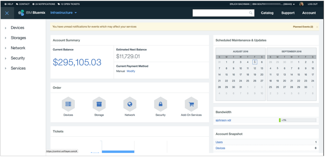
- SoftLayer: Provided IT infrastructure and was used mainly by system administrators. SoftLayer was acquired by IBM.
- Bluemix: Provided an environment for developers to build applications, without requiring much of the IT infrastructure provided by SoftLayer. Bluemix was developed at IBM.
After IBM acquired SoftLayer, both platforms continued to appear to run in isolation as early integration work focused on the backend. But in 2016 we started design work to integrate the two platforms at the portal level. The initial goal was to minimize the disruption to customers using the existing portals. Research included interviews, card sorts, surveys and usability testing.
Contributions: UX Research: card sorting, usability testing, surveys and recommendationsCategory Research
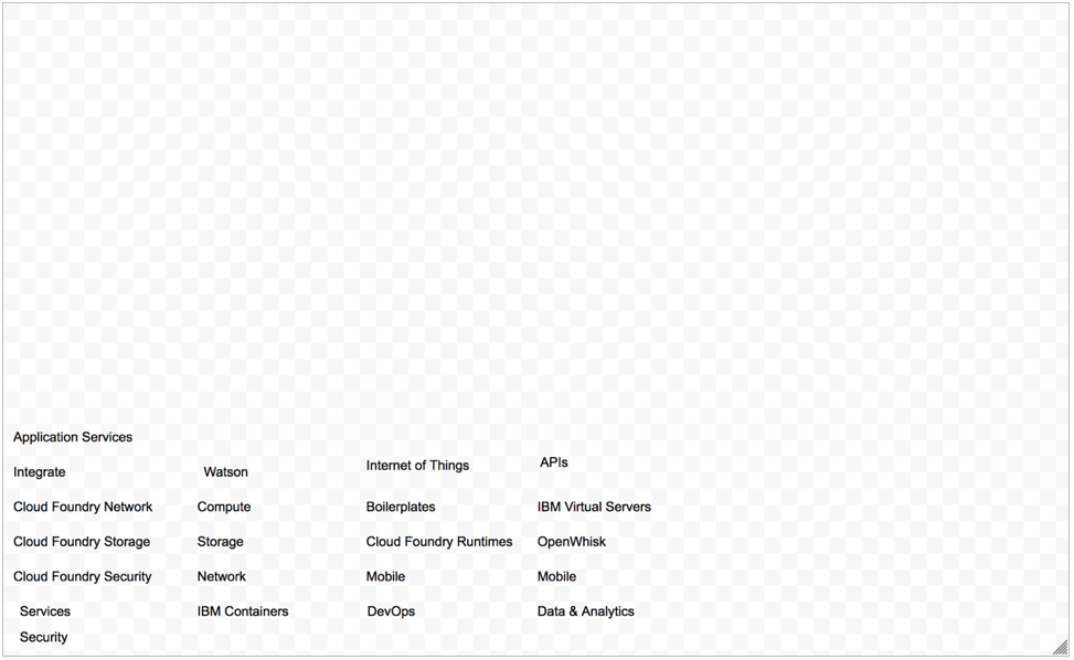
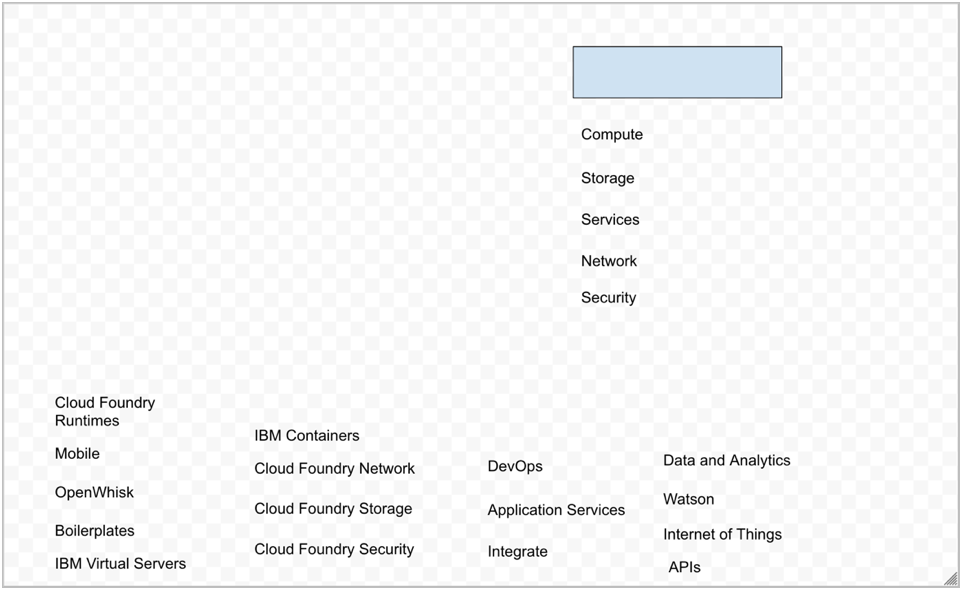
To start, my colleague and I used a series of card sorts to understand how customers naturally categorized the different services and how they would respond to our design constraint to keep the infrastructure UI as intact as possible for the first phase. This was done to provide a transition period for customers. As a result, we constrained the number of categories for the second and third sorts. In all, users completed three sorts:
- Open-ended sort. Users could sort products without constraints.
- Two-category sort. We had the infrastructure category presorted, then had users sort the remaining items into two categories.
- Three-category sort. This activity was identical to the second one, but had three categories.


From this research, “Infrastructure” and “Platform” emerged as clear categories. Customers chose to align services with different jobs categories that would use them (system administrators and developers, respectively). The items that users had trouble placing were newer services that overlapped the categories such as containers. We later made the overlapping ones a top-level category, which was called "Apps".
Prototype Usability Testing
After we set top-level categories, I ran a remote usability test in InVision using mockups to explore our initial designs. Nine customers representing a mixture of IaaS and PaaS users participated. All were at least generally familiar with both services. We evaluated some different navigation concepts with an expandable menu and a labeled menu. We also tested updates to the infrastructure pages.
Customers were generally successful, but the test uncovered some issues as well, I created 41 recommended design updates. One theme was minimizing clicks and consolidating navigation. For the final version users used the left navigation to move between high-level categories.

Outcomes
Customers of SoftLayer were able to continue using their existing UI but after the update, 100K+ customers moved to the new experience and were able to manage PaaS and IaaS offerings in one console.
I did a Post-Update Survey that showed that the updates did not cause any major issues with navigation. However, I found a variety of related smaller issues that were fixed afterwards.