Cloud Status at a Glance (2011)
While I was working on IBM SmartCloud Entry, I also designed a mobile app. The mobile app focused on alerting and basic monitoring for the administrator, leaving keyboard and screen-intensive tasks for the web console version. It was also a good example of the power of storytelling.
Contributions: UX Design, UX Research
Research
When emergencies happen outside of work hours, IT administrators are on call to fix them. The first step is triaging the problem, which at the time, required them log into the management console from their laptop. This was a huge disruption when they were out with their family or at 2:00 AM. But many problems But many problems could be redirected to another team, postponed or solved with a few clicks and the mobile app was intended to address these.
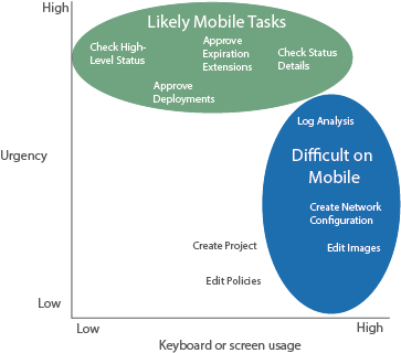
Customer research found that mobile management UIs were good for tasks that were simple but high-impact: alerting, status checks and approvals. Other tasks did not lend themselves to mobile, for example, customers said they would go to their laptop for anything involving significant typing or scrolling. Other tasks required planning and approvals and likely wouldn't be done while they were on the run. The phone app gave them a way to quickly resolve some tasks and to know which ones required their laptop. It also helped them to get back to their lives quickly.
I used a scenario that described the Cloud Administrator checking on the cloud while on vacation. The scenario helps illustrate when a user would and would and wouldn't use the mobile app.

Michael, the cloud administrator for SmartCloud Entry, is on vacation at the beach. He wants to enjoy his vacation, but needs to check on the environment periodically. He wants to do a quick check, quickly resolve anything he can, and then get back to his vacation. He brought his laptop, but wants to leave it in the house while he’s on the beach.
He wants to use his phone to do:
- Quick status checks
- Quick problem diagnosis that he can then assign to a coworker
- Deployment approvals
He will go to his laptop for:
- Detailed log analysis (not enough screen area to read)
- Image editing (too keyboard intensive)
Concept
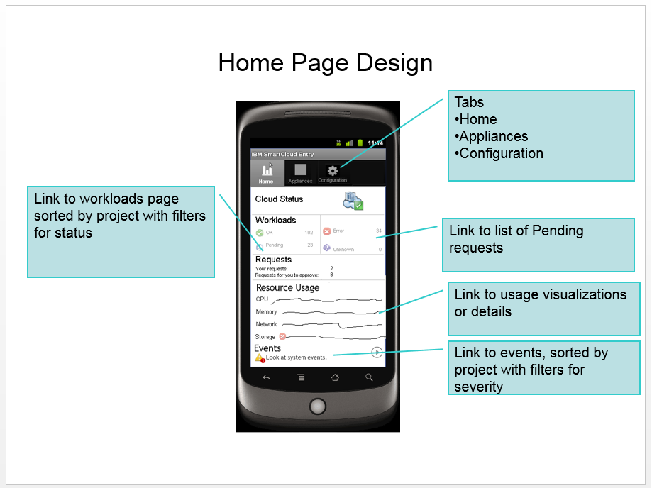
My design goal was to provide a home page that let Michael log in, see if everything was OK, then get back to his vacation. If not, each of the items on the status page would link to the details. The concept shows a rough mockup.
Key Tasks
Detail Pages
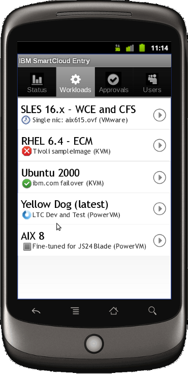
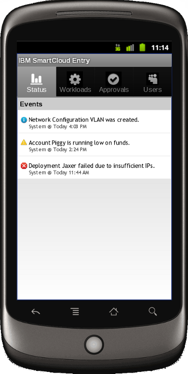
From the status page, Michael could drill down to see a list of his virtual machines (then called "Workloads") and events.
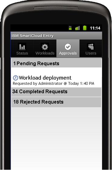
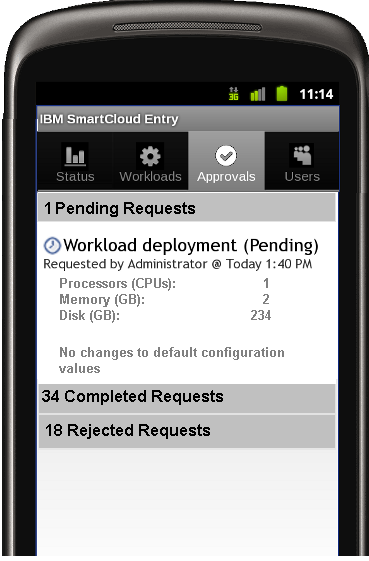
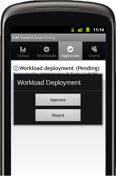
Deployment Approval Flow
Another important function was deployment approvals, where the administrator could be a bottleneck. Michael doesn't want to hold up developers needing approvals, so it was helpful for him to approve on the go.
Outcomes
We did build an alpha version that got some good feedback from testers. While it was not released, this project became a concise way of illustrating the value of personas and scenarios to the team and I shared it with others in the company as an example of optimizing a mobile app for IT administrators.